
Project 02 V2 Starter Code

Project 2
Exploratory Data Analysis (EDA)
Your hometown mayor just created a new data analysis team to give policy advice, and the administration recruited you via LinkedIn to join it. Unfortunately, due to budget constraints, for now the “team” is just you…
The mayor wants to start a new initiative to move the needle on one of two separate issues: high school education outcomes, or drug abuse in the community.
Also unfortunately, that is the entirety of what you’ve been told. And the mayor just went on a lobbyist-funded fact-finding trip in the Bahamas. In the meantime, you got your hands on two national datasets: one on SAT scores by state, and one on drug use by age. Start exploring these to look for useful patterns and possible hypotheses!
This project is focused on exploratory data analysis, aka “EDA”. EDA is an essential part of the data science analysis pipeline. Failure to perform EDA before modeling is almost guaranteed to lead to bad models and faulty conclusions. What you do in this project are good practices for all projects going forward, especially those after this bootcamp!
This lab includes a variety of plotting problems. Much of the plotting code will be left up to you to find either in the lecture notes, or if not there, online. There are massive amounts of code snippets either in documentation or sites like Stack Overflow that have almost certainly done what you are trying to do.
Get used to googling for code! You will use it every single day as a data scientist, especially for visualization and plotting.
Package imports
import numpy as np
import scipy.stats as stats
import pandas as pd
import matplotlib.pyplot as plt
import seaborn as sns


# this line tells jupyter notebook to put the plots in the notebook rather than saving them to file.
%matplotlib inline

# this line makes plots prettier on mac retina screens. If you don't have one it shouldn't do anything.
%config InlineBackend.figure_format = 'retina'

1. Load the sat_scores.csv dataset and describe it
NOTE: All CSVs are in the same directory as this notebook
# Gave the dataset a variable name "sat"
sat = 'sat_scores.csv'
1.1 Make a pandas DataFrame object with pandas .read_csv() function
Take a look at the .dtypes attribute in the DataFrame.
# Loaded the data set by using pd.read_csv and called the sat variable.
# Gave the data set the variable name "sat_scores".
# Called the variable "sat_scores" to view the data.

sat_scores = pd.read_csv(sat)

sat_scores
| State | Rate | Verbal | Math | |
|---|---|---|---|---|
| 0 | CT | 82 | 509 | 510 |
| 1 | NJ | 81 | 499 | 513 |
| 2 | MA | 79 | 511 | 515 |
| 3 | NY | 77 | 495 | 505 |
| 4 | NH | 72 | 520 | 516 |
| 5 | RI | 71 | 501 | 499 |
| 6 | PA | 71 | 500 | 499 |
| 7 | VT | 69 | 511 | 506 |
| 8 | ME | 69 | 506 | 500 |
| 9 | VA | 68 | 510 | 501 |
| 10 | DE | 67 | 501 | 499 |
| 11 | MD | 65 | 508 | 510 |
| 12 | NC | 65 | 493 | 499 |
| 13 | GA | 63 | 491 | 489 |
| 14 | IN | 60 | 499 | 501 |
| 15 | SC | 57 | 486 | 488 |
| 16 | DC | 56 | 482 | 474 |
| 17 | OR | 55 | 526 | 526 |
| 18 | FL | 54 | 498 | 499 |
| 19 | WA | 53 | 527 | 527 |
| 20 | TX | 53 | 493 | 499 |
| 21 | HI | 52 | 485 | 515 |
| 22 | AK | 51 | 514 | 510 |
| 23 | CA | 51 | 498 | 517 |
| 24 | AZ | 34 | 523 | 525 |
| 25 | NV | 33 | 509 | 515 |
| 26 | CO | 31 | 539 | 542 |
| 27 | OH | 26 | 534 | 439 |
| 28 | MT | 23 | 539 | 539 |
| 29 | WV | 18 | 527 | 512 |
| 30 | ID | 17 | 543 | 542 |
| 31 | TN | 13 | 562 | 553 |
| 32 | NM | 13 | 551 | 542 |
| 33 | IL | 12 | 576 | 589 |
| 34 | KY | 12 | 550 | 550 |
| 35 | WY | 11 | 547 | 545 |
| 36 | MI | 11 | 561 | 572 |
| 37 | MN | 9 | 580 | 589 |
| 38 | KS | 9 | 577 | 580 |
| 39 | AL | 9 | 559 | 554 |
| 40 | NE | 8 | 562 | 568 |
| 41 | OK | 8 | 567 | 561 |
| 42 | MO | 8 | 577 | 577 |
| 43 | LA | 7 | 564 | 562 |
| 44 | WI | 6 | 584 | 596 |
| 45 | AR | 6 | 562 | 550 |
| 46 | UT | 5 | 575 | 570 |
| 47 | IA | 5 | 593 | 603 |
| 48 | SD | 4 | 577 | 582 |
| 49 | ND | 4 | 592 | 599 |
| 50 | MS | 4 | 566 | 551 |
| 51 | All | 45 | 506 | 514 |
# Used .dtypes to see the types of data.

sat_scores.dtypes
State     object
Rate       int64
Verbal     int64
Math       int64
dtype: object
1.2 Look at the first ten rows of the DataFrame: what does our data describe?
From now on, use the DataFrame loaded from the file using the .read_csv() function.
Use the .head(num) built-in DataFrame function, where num is the number of rows to print out.
You are not given a “codebook” with this data, so you will have to make some (very minor) inference.
# used .head(10) in order to view the first 10 rows of the DataFrame.

sat_scores.head(10)
| State | Rate | Verbal | Math | |
|---|---|---|---|---|
| 0 | CT | 82 | 509 | 510 |
| 1 | NJ | 81 | 499 | 513 |
| 2 | MA | 79 | 511 | 515 |
| 3 | NY | 77 | 495 | 505 |
| 4 | NH | 72 | 520 | 516 |
| 5 | RI | 71 | 501 | 499 |
| 6 | PA | 71 | 500 | 499 |
| 7 | VT | 69 | 511 | 506 |
| 8 | ME | 69 | 506 | 500 |
| 9 | VA | 68 | 510 | 501 |
2. Create a “data dictionary” based on the data
A data dictionary is an object that describes your data. This should contain the name of each variable (column), the type of the variable, your description of what the variable is, and the shape (rows and columns) of the entire dataset.
# Used .columns to view the names of all the columns in the DataFrame.

sat_scores.columns
Index(['State', 'Rate', 'Verbal', 'Math'], dtype='object')
# Used .describe to see the attributes of the DataFrame

sat_scores.describe()
| Rate | Verbal | Math | |
|---|---|---|---|
| count | 52.000000 | 52.000000 | 52.000000 |
| mean | 37.153846 | 532.019231 | 531.500000 |
| std | 27.301788 | 33.236225 | 36.014975 |
| min | 4.000000 | 482.000000 | 439.000000 |
| 25% | 9.000000 | 501.000000 | 504.000000 |
| 50% | 33.500000 | 526.500000 | 521.000000 |
| 75% | 63.500000 | 562.000000 | 555.750000 |
| max | 82.000000 | 593.000000 | 603.000000 |
# Used .shape to show the shape (rows x columns) of the DataFrame.

sat_scores.shape
(52, 4)
# Used .dytpes to show the types(object, integer, float, e.g.) of the DataFrame.

sat_scores.dtypes
State     object
Rate       int64
Verbal     int64
Math       int64
dtype: object
# Created a Data dictionary after calling .describe, .shape and .dtypes
# Data Dictionary:

# Variable  Definition        Type
# State      State             object
# Rate       Rate              int64
# Verbal     Verbal Score      int64
# Math       Math Score        int64

# The shape of the DataFrame is 52 rows by 4 columns
3. Plot the data using seaborn
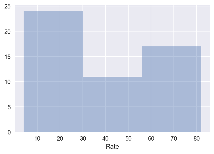
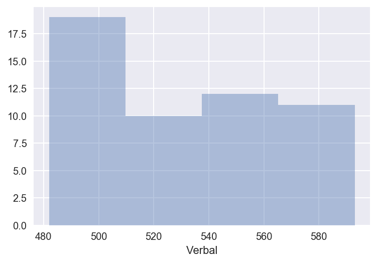
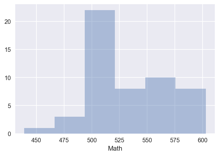
3.1 Using seaborn’s distplot, plot the distributions for each of Rate, Math, and Verbal
Set the keyword argument kde=False. This way you can actually see the counts within bins. You can adjust the number of bins to your liking.
# Used Seaborn's distplot with each variable separately. This one is for "Rate".

sns.distplot(sat_scores["Rate"], kde=False)
<matplotlib.axes._subplots.AxesSubplot at 0x1186505c0>
# Used Seaborn's distplot with each variable separately. This one is for "Verbal".

sns.distplot(sat_scores["Verbal"], kde=False)
<matplotlib.axes._subplots.AxesSubplot at 0x11872db70>
# Used Seaborn's distplot with each variable separately. This one is for "Math".

sns.distplot(sat_scores["Math"], kde=False)
<matplotlib.axes._subplots.AxesSubplot at 0x1187430b8>
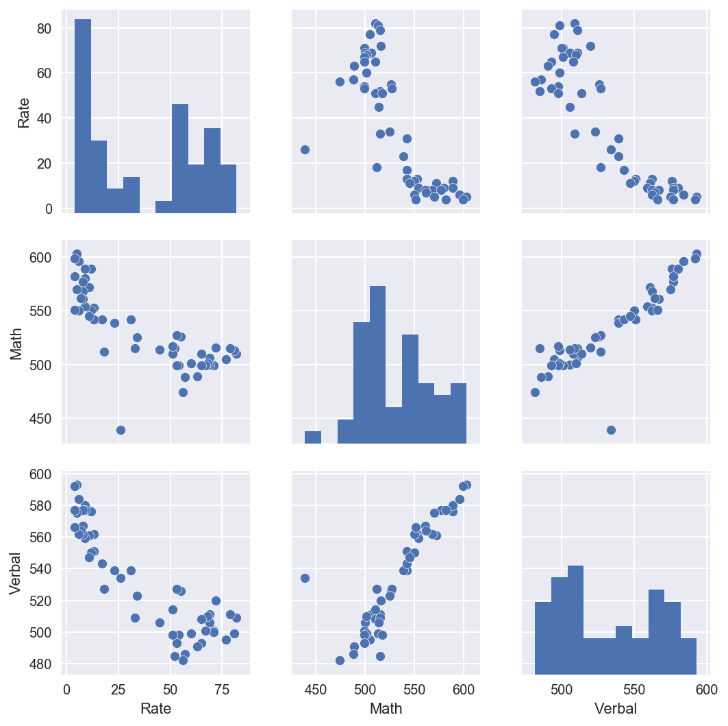
3.2 Using seaborn’s pairplot, show the joint distributions for each of Rate, Math, and Verbal
Explain what the visualization tells you about your data.
Please read over the pairplot documentation to fine-tune your chart.
# Used Seaborn's pairplot with the 3 variables ("Rate", "Math", "Verbal") in one double bracket.

sns.pairplot(sat_scores[["Rate", "Math", "Verbal"]])
<seaborn.axisgrid.PairGrid at 0x1185c1550>
4. Plot the data using built-in pandas functions.
Pandas is very powerful and contains a variety of nice, built-in plotting functions for your data. Read the documentation here to understand the capabilities:
http://pandas.pydata.org/pandas-docs/stable/visualization.html
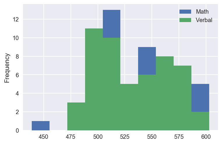
4.1 Plot a stacked histogram with Verbal and Math using pandas
# Plotted Stacked Histogram for Verbal and Math
sat_scores[['Math', 'Verbal']].plot.hist(grid=True,by=None)
<matplotlib.axes._subplots.AxesSubplot at 0x11b1632e8>
4.2 Plot Verbal and Math on the same chart using boxplots
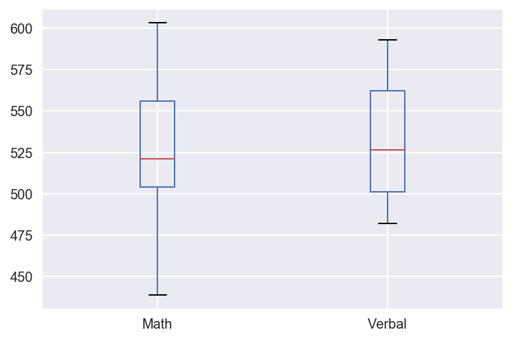
What are the benefits of using a boxplot as compared to a scatterplot or a histogram?
What’s wrong with plotting a box-plot of Rate on the same chart as Math and Verbal?
# Plotted Box Blot for Verbal and Math
sat_scores[['Math', 'Verbal']].plot.box(grid=True,by=None)
<matplotlib.axes._subplots.AxesSubplot at 0x119e24278>

4.3 Plot Verbal, Math, and Rate appropriately on the same boxplot chart
Think about how you might change the variables so that they would make sense on the same chart. Explain your rationale for the choices on the chart. You should strive to make the chart as intuitive as possible.
5. Create and examine subsets of the data
For these questions you will practice masking in pandas. Masking uses conditional statements to select portions of your DataFrame (through boolean operations under the hood.)
Remember the distinction between DataFrame indexing functions in pandas:
.iloc[row, col] : row and column are specified by index, which are integers
.loc[row, col]  : row and column are specified by string "labels" (boolean arrays are allowed; useful for rows)
For detailed reference and tutorial make sure to read over the pandas documentation:
http://pandas.pydata.org/pandas-docs/stable/indexing.html
5.1 Find the list of states that have an average Verbal score greater than the average of Verbal scores across the entire dataset
How many states are above the mean? What does this tell you about the distribution of Verbal scores?
# Gave the mean of the "Verbal" column throughout the total DataFrame the variable name "sat_verbal_mean".
sat_verbal_mean = sat_scores['Verbal'].mean()

# Gave the mean of the states, whose mean was greater than the mean of the entire DataFrame, the variable name "state_verbal_mean"
state_verbal_mean = sat_scores[sat_scores['Verbal'] > sat_verbal_mean]

# Only showed the Index of the State, the State and the Mean Verbal score.
state_verbal_mean[["State" , "Verbal"]]
| State | Verbal | |
|---|---|---|
| 26 | CO | 539 |
| 27 | OH | 534 |
| 28 | MT | 539 |
| 30 | ID | 543 |
| 31 | TN | 562 |
| 32 | NM | 551 |
| 33 | IL | 576 |
| 34 | KY | 550 |
| 35 | WY | 547 |
| 36 | MI | 561 |
| 37 | MN | 580 |
| 38 | KS | 577 |
| 39 | AL | 559 |
| 40 | NE | 562 |
| 41 | OK | 567 |
| 42 | MO | 577 |
| 43 | LA | 564 |
| 44 | WI | 584 |
| 45 | AR | 562 |
| 46 | UT | 575 |
| 47 | IA | 593 |
| 48 | SD | 577 |
| 49 | ND | 592 |
| 50 | MS | 566 |
# 24 States are above the Mean, which means 26 States are at or below the mean.  That means the data is normally distributed.

state_verbal_mean.count()
State     24
Rate      24
Verbal    24
Math      24
dtype: int64
5.2 Find the list of states that have a median Verbal score greater than the median of Verbal scores across the entire dataset
How does this compare to the list of states greater than the mean of Verbal scores? Why?
# Gave the median of the "Verbal" column throughout the total DataFrame the variable name "sat_verbal_median".
sat_verbal_median = sat_scores['Verbal'].median()

# Gave the median of the states, whose median was greater than the median of the entire DataFrame, the variable name "state_verbal_median"
state_verbal_median = sat_scores[sat_scores['Verbal'] > sat_verbal_median]

# Only showed the Index of the State, the State and the Median Verbal score.
state_verbal_median[["State" , "Verbal"]]
| State | Verbal | |
|---|---|---|
| 19 | WA | 527 |
| 26 | CO | 539 |
| 27 | OH | 534 |
| 28 | MT | 539 |
| 29 | WV | 527 |
| 30 | ID | 543 |
| 31 | TN | 562 |
| 32 | NM | 551 |
| 33 | IL | 576 |
| 34 | KY | 550 |
| 35 | WY | 547 |
| 36 | MI | 561 |
| 37 | MN | 580 |
| 38 | KS | 577 |
| 39 | AL | 559 |
| 40 | NE | 562 |
| 41 | OK | 567 |
| 42 | MO | 577 |
| 43 | LA | 564 |
| 44 | WI | 584 |
| 45 | AR | 562 |
| 46 | UT | 575 |
| 47 | IA | 593 |
| 48 | SD | 577 |
| 49 | ND | 592 |
| 50 | MS | 566 |
# Washington & West Virginia appear on the Median list, but not on the Mean List. They have outliers in their data.

state_verbal_median.count()
State     26
Rate      26
Verbal    26
Math      26
dtype: int64
5.3 Create a column that is the difference between the Verbal and Math scores
Specifically, this should be Verbal - Math.
# Created a column called and "Verbal_Less_Math" and assigned it to "sat_scores" Assigned the formula of Verbal scores - Math scores.

sat_scores['Verbal_Less_Math'] = sat_scores['Verbal'] - sat_scores['Math']
sat_scores
| State | Rate | Verbal | Math | Verbal_Less_Math | |
|---|---|---|---|---|---|
| 0 | CT | 82 | 509 | 510 | -1 |
| 1 | NJ | 81 | 499 | 513 | -14 |
| 2 | MA | 79 | 511 | 515 | -4 |
| 3 | NY | 77 | 495 | 505 | -10 |
| 4 | NH | 72 | 520 | 516 | 4 |
| 5 | RI | 71 | 501 | 499 | 2 |
| 6 | PA | 71 | 500 | 499 | 1 |
| 7 | VT | 69 | 511 | 506 | 5 |
| 8 | ME | 69 | 506 | 500 | 6 |
| 9 | VA | 68 | 510 | 501 | 9 |
| 10 | DE | 67 | 501 | 499 | 2 |
| 11 | MD | 65 | 508 | 510 | -2 |
| 12 | NC | 65 | 493 | 499 | -6 |
| 13 | GA | 63 | 491 | 489 | 2 |
| 14 | IN | 60 | 499 | 501 | -2 |
| 15 | SC | 57 | 486 | 488 | -2 |
| 16 | DC | 56 | 482 | 474 | 8 |
| 17 | OR | 55 | 526 | 526 | 0 |
| 18 | FL | 54 | 498 | 499 | -1 |
| 19 | WA | 53 | 527 | 527 | 0 |
| 20 | TX | 53 | 493 | 499 | -6 |
| 21 | HI | 52 | 485 | 515 | -30 |
| 22 | AK | 51 | 514 | 510 | 4 |
| 23 | CA | 51 | 498 | 517 | -19 |
| 24 | AZ | 34 | 523 | 525 | -2 |
| 25 | NV | 33 | 509 | 515 | -6 |
| 26 | CO | 31 | 539 | 542 | -3 |
| 27 | OH | 26 | 534 | 439 | 95 |
| 28 | MT | 23 | 539 | 539 | 0 |
| 29 | WV | 18 | 527 | 512 | 15 |
| 30 | ID | 17 | 543 | 542 | 1 |
| 31 | TN | 13 | 562 | 553 | 9 |
| 32 | NM | 13 | 551 | 542 | 9 |
| 33 | IL | 12 | 576 | 589 | -13 |
| 34 | KY | 12 | 550 | 550 | 0 |
| 35 | WY | 11 | 547 | 545 | 2 |
| 36 | MI | 11 | 561 | 572 | -11 |
| 37 | MN | 9 | 580 | 589 | -9 |
| 38 | KS | 9 | 577 | 580 | -3 |
| 39 | AL | 9 | 559 | 554 | 5 |
| 40 | NE | 8 | 562 | 568 | -6 |
| 41 | OK | 8 | 567 | 561 | 6 |
| 42 | MO | 8 | 577 | 577 | 0 |
| 43 | LA | 7 | 564 | 562 | 2 |
| 44 | WI | 6 | 584 | 596 | -12 |
| 45 | AR | 6 | 562 | 550 | 12 |
| 46 | UT | 5 | 575 | 570 | 5 |
| 47 | IA | 5 | 593 | 603 | -10 |
| 48 | SD | 4 | 577 | 582 | -5 |
| 49 | ND | 4 | 592 | 599 | -7 |
| 50 | MS | 4 | 566 | 551 | 15 |
| 51 | All | 45 | 506 | 514 | -8 |
5.4 Create two new DataFrames showing states with the greatest difference between scores
- Your first DataFrame should be the 10 states with the greatest gap between
VerbalandMathscores whereVerbalis greater thanMath. It should be sorted appropriately to show the ranking of states. - Your second DataFrame will be the inverse: states with the greatest gap between
VerbalandMathsuch thatMathis greater thanVerbal. Again, this should be sorted appropriately to show rank. - Print the header of both variables, only showing the top 3 states in each.
# Used .sort_values and assigned it to "Verbal_Less_Math". Made it sort descending by the top 10 States that have a verbal - math score difference

sat_scores.sort_values('Verbal_Less_Math',ascending=False).head(10)
| State | Rate | Verbal | Math | Verbal_Less_Math | |
|---|---|---|---|---|---|
| 27 | OH | 26 | 534 | 439 | 95 |
| 50 | MS | 4 | 566 | 551 | 15 |
| 29 | WV | 18 | 527 | 512 | 15 |
| 45 | AR | 6 | 562 | 550 | 12 |
| 32 | NM | 13 | 551 | 542 | 9 |
| 31 | TN | 13 | 562 | 553 | 9 |
| 9 | VA | 68 | 510 | 501 | 9 |
| 16 | DC | 56 | 482 | 474 | 8 |
| 8 | ME | 69 | 506 | 500 | 6 |
| 41 | OK | 8 | 567 | 561 | 6 |
6. Examine summary statistics
Checking the summary statistics for data is an essential step in the EDA process!
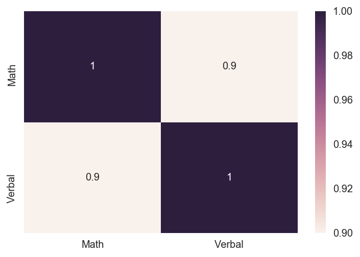
6.1 Create the correlation matrix of your variables (excluding State).
- Use seaborn’s
.heatmapmethod to add some color to the matrix - Set
annot=True
# Created the correlation matrix using .corr and excluded the "State" column.

corr_sat_scores = sat_scores[['Math', 'Verbal']].corr()
corr_sat_scores
| Math | Verbal | |
|---|---|---|
| Math | 1.000000 | 0.899871 |
| Verbal | 0.899871 | 1.000000 |
# Created a heatmap with the correlation matrix.

sns.heatmap(corr_sat_scores, annot=True)
<matplotlib.axes._subplots.AxesSubplot at 0x119e6a630>
6.2 Use pandas’ .describe() built-in function on your DataFrame
Write up what each of the rows returned by the function indicate.
# Count counts the rows
# Mean returns the average of each column
# STD returns the standard deviation of each column
# Min returns the minimun value of each column
# Max returns the maximun value of each column
# The 25%, 50%, and 75% are percentiles : array-like, optional
# The percentiles to include in the output. Should all be in the interval [0, 1]. By default percentiles is [.25, .5, .75], returning the 25th, 50th, and 75th percentiles.

sat_scores.describe()
| Rate | Verbal | Math | Verbal_Less_Math | |
|---|---|---|---|---|
| count | 52.000000 | 52.000000 | 52.000000 | 52.000000 |
| mean | 37.153846 | 532.019231 | 531.500000 | 0.519231 |
| std | 27.301788 | 33.236225 | 36.014975 | 15.729939 |
| min | 4.000000 | 482.000000 | 439.000000 | -30.000000 |
| 25% | 9.000000 | 501.000000 | 504.000000 | -6.000000 |
| 50% | 33.500000 | 526.500000 | 521.000000 | 0.000000 |
| 75% | 63.500000 | 562.000000 | 555.750000 | 4.250000 |
| max | 82.000000 | 593.000000 | 603.000000 | 95.000000 |
6.3 Assign and print the covariance matrix for the dataset
- Describe how the covariance matrix is different from the correlation matrix.
- What is the process to convert the covariance into the correlation?
- Why is the correlation matrix preferred to the covariance matrix for examining relationships in your data?
# Covariance
# You tend to use the covariance matrix when the variable scales are similar and the correlation matrix when variables are on different scales.

sat_scores.cov()
| Rate | Verbal | Math | Verbal_Less_Math | |
|---|---|---|---|---|
| Rate | 745.387632 | -804.355958 | -760.803922 | -43.552036 |
| Verbal | -804.355958 | 1104.646682 | 1077.147059 | 27.499623 |
| Math | -760.803922 | 1077.147059 | 1297.078431 | -219.931373 |
| Verbal_Less_Math | -43.552036 | 27.499623 | -219.931373 | 247.430995 |
7. Performing EDA on “drug use by age” data.
You will now switch datasets to one with many more variables. This section of the project is more open-ended - use the techniques you practiced above!
We’ll work with the “drug-use-by-age.csv” data, sourced from and described here: https://github.com/fivethirtyeight/data/tree/master/drug-use-by-age.
7.1
Load the data using pandas. Does this data require cleaning? Are variables missing? How will this affect your approach to EDA on the data?
# Loaded the dataset

drug_use = pd.read_csv('drug-use-by-age.csv')
drug_use
| age | n | alcohol-use | alcohol-frequency | marijuana-use | marijuana-frequency | cocaine-use | cocaine-frequency | crack-use | crack-frequency | ... | oxycontin-use | oxycontin-frequency | tranquilizer-use | tranquilizer-frequency | stimulant-use | stimulant-frequency | meth-use | meth-frequency | sedative-use | sedative-frequency | |
|---|---|---|---|---|---|---|---|---|---|---|---|---|---|---|---|---|---|---|---|---|---|
| 0 | 12 | 2798 | 3.9 | 3.0 | 1.1 | 4.0 | 0.1 | 5.0 | 0.0 | - | ... | 0.1 | 24.5 | 0.2 | 52.0 | 0.2 | 2.0 | 0.0 | - | 0.2 | 13.0 |
| 1 | 13 | 2757 | 8.5 | 6.0 | 3.4 | 15.0 | 0.1 | 1.0 | 0.0 | 3.0 | ... | 0.1 | 41.0 | 0.3 | 25.5 | 0.3 | 4.0 | 0.1 | 5.0 | 0.1 | 19.0 |
| 2 | 14 | 2792 | 18.1 | 5.0 | 8.7 | 24.0 | 0.1 | 5.5 | 0.0 | - | ... | 0.4 | 4.5 | 0.9 | 5.0 | 0.8 | 12.0 | 0.1 | 24.0 | 0.2 | 16.5 |
| 3 | 15 | 2956 | 29.2 | 6.0 | 14.5 | 25.0 | 0.5 | 4.0 | 0.1 | 9.5 | ... | 0.8 | 3.0 | 2.0 | 4.5 | 1.5 | 6.0 | 0.3 | 10.5 | 0.4 | 30.0 |
| 4 | 16 | 3058 | 40.1 | 10.0 | 22.5 | 30.0 | 1.0 | 7.0 | 0.0 | 1.0 | ... | 1.1 | 4.0 | 2.4 | 11.0 | 1.8 | 9.5 | 0.3 | 36.0 | 0.2 | 3.0 |
| 5 | 17 | 3038 | 49.3 | 13.0 | 28.0 | 36.0 | 2.0 | 5.0 | 0.1 | 21.0 | ... | 1.4 | 6.0 | 3.5 | 7.0 | 2.8 | 9.0 | 0.6 | 48.0 | 0.5 | 6.5 |
| 6 | 18 | 2469 | 58.7 | 24.0 | 33.7 | 52.0 | 3.2 | 5.0 | 0.4 | 10.0 | ... | 1.7 | 7.0 | 4.9 | 12.0 | 3.0 | 8.0 | 0.5 | 12.0 | 0.4 | 10.0 |
| 7 | 19 | 2223 | 64.6 | 36.0 | 33.4 | 60.0 | 4.1 | 5.5 | 0.5 | 2.0 | ... | 1.5 | 7.5 | 4.2 | 4.5 | 3.3 | 6.0 | 0.4 | 105.0 | 0.3 | 6.0 |
| 8 | 20 | 2271 | 69.7 | 48.0 | 34.0 | 60.0 | 4.9 | 8.0 | 0.6 | 5.0 | ... | 1.7 | 12.0 | 5.4 | 10.0 | 4.0 | 12.0 | 0.9 | 12.0 | 0.5 | 4.0 |
| 9 | 21 | 2354 | 83.2 | 52.0 | 33.0 | 52.0 | 4.8 | 5.0 | 0.5 | 17.0 | ... | 1.3 | 13.5 | 3.9 | 7.0 | 4.1 | 10.0 | 0.6 | 2.0 | 0.3 | 9.0 |
| 10 | 22-23 | 4707 | 84.2 | 52.0 | 28.4 | 52.0 | 4.5 | 5.0 | 0.5 | 5.0 | ... | 1.7 | 17.5 | 4.4 | 12.0 | 3.6 | 10.0 | 0.6 | 46.0 | 0.2 | 52.0 |
| 11 | 24-25 | 4591 | 83.1 | 52.0 | 24.9 | 60.0 | 4.0 | 6.0 | 0.5 | 6.0 | ... | 1.3 | 20.0 | 4.3 | 10.0 | 2.6 | 10.0 | 0.7 | 21.0 | 0.2 | 17.5 |
| 12 | 26-29 | 2628 | 80.7 | 52.0 | 20.8 | 52.0 | 3.2 | 5.0 | 0.4 | 6.0 | ... | 1.2 | 13.5 | 4.2 | 10.0 | 2.3 | 7.0 | 0.6 | 30.0 | 0.4 | 4.0 |
| 13 | 30-34 | 2864 | 77.5 | 52.0 | 16.4 | 72.0 | 2.1 | 8.0 | 0.5 | 15.0 | ... | 0.9 | 46.0 | 3.6 | 8.0 | 1.4 | 12.0 | 0.4 | 54.0 | 0.4 | 10.0 |
| 14 | 35-49 | 7391 | 75.0 | 52.0 | 10.4 | 48.0 | 1.5 | 15.0 | 0.5 | 48.0 | ... | 0.3 | 12.0 | 1.9 | 6.0 | 0.6 | 24.0 | 0.2 | 104.0 | 0.3 | 10.0 |
| 15 | 50-64 | 3923 | 67.2 | 52.0 | 7.3 | 52.0 | 0.9 | 36.0 | 0.4 | 62.0 | ... | 0.4 | 5.0 | 1.4 | 10.0 | 0.3 | 24.0 | 0.2 | 30.0 | 0.2 | 104.0 |
| 16 | 65+ | 2448 | 49.3 | 52.0 | 1.2 | 36.0 | 0.0 | - | 0.0 | - | ... | 0.0 | - | 0.2 | 5.0 | 0.0 | 364.0 | 0.0 | - | 0.0 | 15.0 |
17 rows × 28 columns
# Cleaned up values

drug_use.replace(to_replace="-", value=0.0, inplace=True)
# viewed the head of the dataset
drug_use.head()
| age | n | alcohol-use | alcohol-frequency | marijuana-use | marijuana-frequency | cocaine-use | cocaine-frequency | crack-use | crack-frequency | ... | oxycontin-use | oxycontin-frequency | tranquilizer-use | tranquilizer-frequency | stimulant-use | stimulant-frequency | meth-use | meth-frequency | sedative-use | sedative-frequency | |
|---|---|---|---|---|---|---|---|---|---|---|---|---|---|---|---|---|---|---|---|---|---|
| 0 | 12 | 2798 | 3.9 | 3.0 | 1.1 | 4.0 | 0.1 | 5.0 | 0.0 | 0 | ... | 0.1 | 24.5 | 0.2 | 52.0 | 0.2 | 2.0 | 0.0 | 0 | 0.2 | 13.0 |
| 1 | 13 | 2757 | 8.5 | 6.0 | 3.4 | 15.0 | 0.1 | 1.0 | 0.0 | 3.0 | ... | 0.1 | 41.0 | 0.3 | 25.5 | 0.3 | 4.0 | 0.1 | 5.0 | 0.1 | 19.0 |
| 2 | 14 | 2792 | 18.1 | 5.0 | 8.7 | 24.0 | 0.1 | 5.5 | 0.0 | 0 | ... | 0.4 | 4.5 | 0.9 | 5.0 | 0.8 | 12.0 | 0.1 | 24.0 | 0.2 | 16.5 |
| 3 | 15 | 2956 | 29.2 | 6.0 | 14.5 | 25.0 | 0.5 | 4.0 | 0.1 | 9.5 | ... | 0.8 | 3.0 | 2.0 | 4.5 | 1.5 | 6.0 | 0.3 | 10.5 | 0.4 | 30.0 |
| 4 | 16 | 3058 | 40.1 | 10.0 | 22.5 | 30.0 | 1.0 | 7.0 | 0.0 | 1.0 | ... | 1.1 | 4.0 | 2.4 | 11.0 | 1.8 | 9.5 | 0.3 | 36.0 | 0.2 | 3.0 |
5 rows × 28 columns
# The shape of the dataframe is 17 rows by 28 columns
drug_use.shape
(17, 28)
# all the objects have been converted to float64
drug_use.dtypes
age                         object
n                            int64
alcohol-use                float64
alcohol-frequency          float64
marijuana-use              float64
marijuana-frequency        float64
cocaine-use                float64
cocaine-frequency           object
crack-use                  float64
crack-frequency             object
heroin-use                 float64
heroin-frequency            object
hallucinogen-use           float64
hallucinogen-frequency     float64
inhalant-use               float64
inhalant-frequency          object
pain-releiver-use          float64
pain-releiver-frequency    float64
oxycontin-use              float64
oxycontin-frequency         object
tranquilizer-use           float64
tranquilizer-frequency     float64
stimulant-use              float64
stimulant-frequency        float64
meth-use                   float64
meth-frequency              object
sedative-use               float64
sedative-frequency         float64
dtype: object
# Change objects to floats


drug_use['cocaine-frequency'] = drug_use['cocaine-frequency'].astype(float)
drug_use['crack-frequency'] = drug_use['crack-frequency'].astype(float)
drug_use['heroin-frequency'] = drug_use['heroin-frequency'].astype(float)
drug_use['inhalant-frequency'] = drug_use['inhalant-frequency'].astype(float)
drug_use['oxycontin-frequency'] = drug_use['oxycontin-frequency'].astype(float)
drug_use['meth-frequency'] = drug_use['meth-frequency'].astype(float)
drug_use.dtypes
age                         object
n                            int64
alcohol-use                float64
alcohol-frequency          float64
marijuana-use              float64
marijuana-frequency        float64
cocaine-use                float64
cocaine-frequency          float64
crack-use                  float64
crack-frequency            float64
heroin-use                 float64
heroin-frequency           float64
hallucinogen-use           float64
hallucinogen-frequency     float64
inhalant-use               float64
inhalant-frequency         float64
pain-releiver-use          float64
pain-releiver-frequency    float64
oxycontin-use              float64
oxycontin-frequency        float64
tranquilizer-use           float64
tranquilizer-frequency     float64
stimulant-use              float64
stimulant-frequency        float64
meth-use                   float64
meth-frequency             float64
sedative-use               float64
sedative-frequency         float64
dtype: object
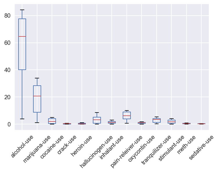
7.2 Do a high-level, initial overview of the data
Get a feel for what this dataset is all about.
Use whichever techniques you’d like, including those from the SAT dataset EDA. The final response to this question should be a written description of what you infer about the dataset.
Some things to consider doing:
- Look for relationships between variables and subsets of those variables’ values
- Derive new features from the ones available to help your analysis
- Visualize everything!
drug_use[["alcohol-use", "marijuana-use", "cocaine-use", "crack-use","heroin-use","hallucinogen-use","inhalant-use","pain-releiver-use", "oxycontin-use","tranquilizer-use","stimulant-use","meth-use","sedative-use"]].plot.box(rot=45)
<matplotlib.axes._subplots.AxesSubplot at 0x11a662ba8>
7.3 Create a testable hypothesis about this data
Requirements for the question:
- Write a specific question you would like to answer with the data (that can be accomplished with EDA).
- Write a description of the “deliverables”: what will you report after testing/examining your hypothesis?
- Use EDA techniques of your choice, numeric and/or visual, to look into your question.
- Write up your report on what you have found regarding the hypothesis about the data you came up with.
Your hypothesis could be on:
- Difference of group means
- Correlations between variables
- Anything else you think is interesting, testable, and meaningful!
Important notes:
You should be only doing EDA relevant to your question here. It is easy to go down rabbit holes trying to look at every facet of your data, and so we want you to get in the practice of specifying a hypothesis you are interested in first and scoping your work to specifically answer that question.
Some of you may want to jump ahead to “modeling” data to answer your question. This is a topic addressed in the next project and you should not do this for this project. We specifically want you to not do modeling to emphasize the importance of performing EDA before you jump to statistical analysis.
** Question and deliverables**
…
# Code

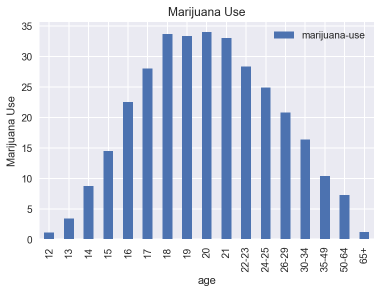
drug_use.plot('age', 'marijuana-use', kind='bar')
plt.ylabel('Marijuana Use')
plt.title('Marijuana Use')
plt.plot()

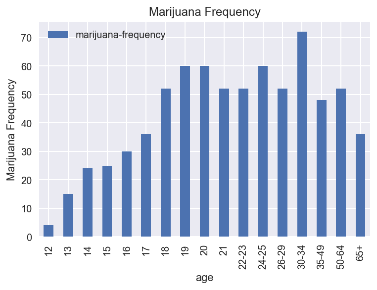
drug_use.plot('age', 'marijuana-frequency', kind='bar')
plt.ylabel('Marijuana Frequency')
plt.title('Marijuana Frequency')
plt.plot()

# Marijuana use increases from age 12 to 20, then almost symetrically decreases until 65+.
# Marijuana frequency rapidly increases from age 12 to 20, levels off until 29. It spikes up from 30-34
# and then settles back down from age 50 to 65+.
[]
Report
…
8. Introduction to dealing with outliers
Outliers are an interesting problem in statistics, in that there is not an agreed upon best way to define them. Subjectivity in selecting and analyzing data is a problem that will recur throughout the course.
- Pull out the rate variable from the SAT dataset.
- Are there outliers in the dataset? Define, in words, how you numerically define outliers.
- Print out the outliers in the dataset.
- Remove the outliers from the dataset.
- Compare the mean, median, and standard deviation of the “cleaned” data without outliers to the original. What is different about them and why?

9. Percentile scoring and spearman rank correlation
9.1 Calculate the spearman correlation of sat Verbal and Math
- How does the spearman correlation compare to the pearson correlation?
- Describe clearly in words the process of calculating the spearman rank correlation.
- Hint: the word “rank” is in the name of the process for a reason!
9.2 Percentile scoring
Look up percentile scoring of data. In other words, the conversion of numeric data to their equivalent percentile scores.
http://docs.scipy.org/doc/numpy-dev/reference/generated/numpy.percentile.html
http://docs.scipy.org/doc/scipy/reference/generated/scipy.stats.percentileofscore.html
- Convert
Rateto percentiles in the sat scores as a new column. - Show the percentile of California in
Rate. - How is percentile related to the spearman rank correlation?
9.3 Percentiles and outliers
- Why might percentile scoring be useful for dealing with outliers?
- Plot the distribution of a variable of your choice from the drug use dataset.
- Plot the same variable but percentile scored.
- Describe the effect, visually, of coverting raw scores to percentile.